Pakke.dk ux
Wireframing, designs, ux, ui, collaboration

For dummies
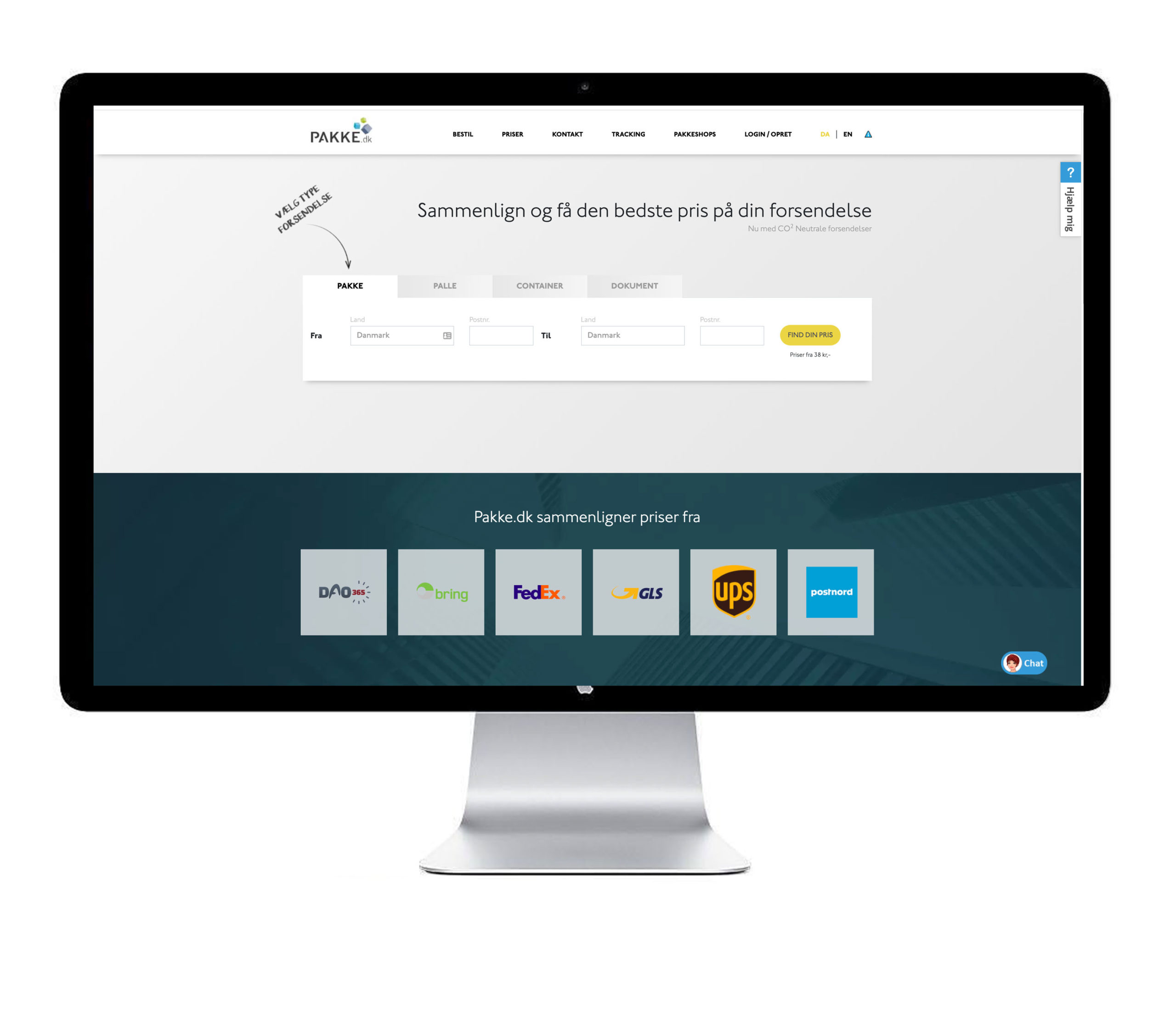
We were given the task to re-design pakke.dk to optimize the ordering user flow. This resulted in a very simplified first step order box. We structured the website in horizontal layers with different features that could be turned on and off as you wish.
Cards
We used a lot of time to design an automated price-view. You should be able to quickly choose between price, and time and convenience. We created small cards to hold the essential information that was laid out in a visual hierarchy.
Selected Works

When Tech SparksWebinar concept
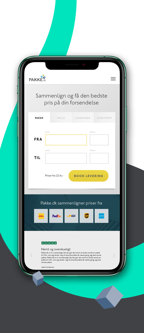
Pakke dk RedesignUx/Ui Design
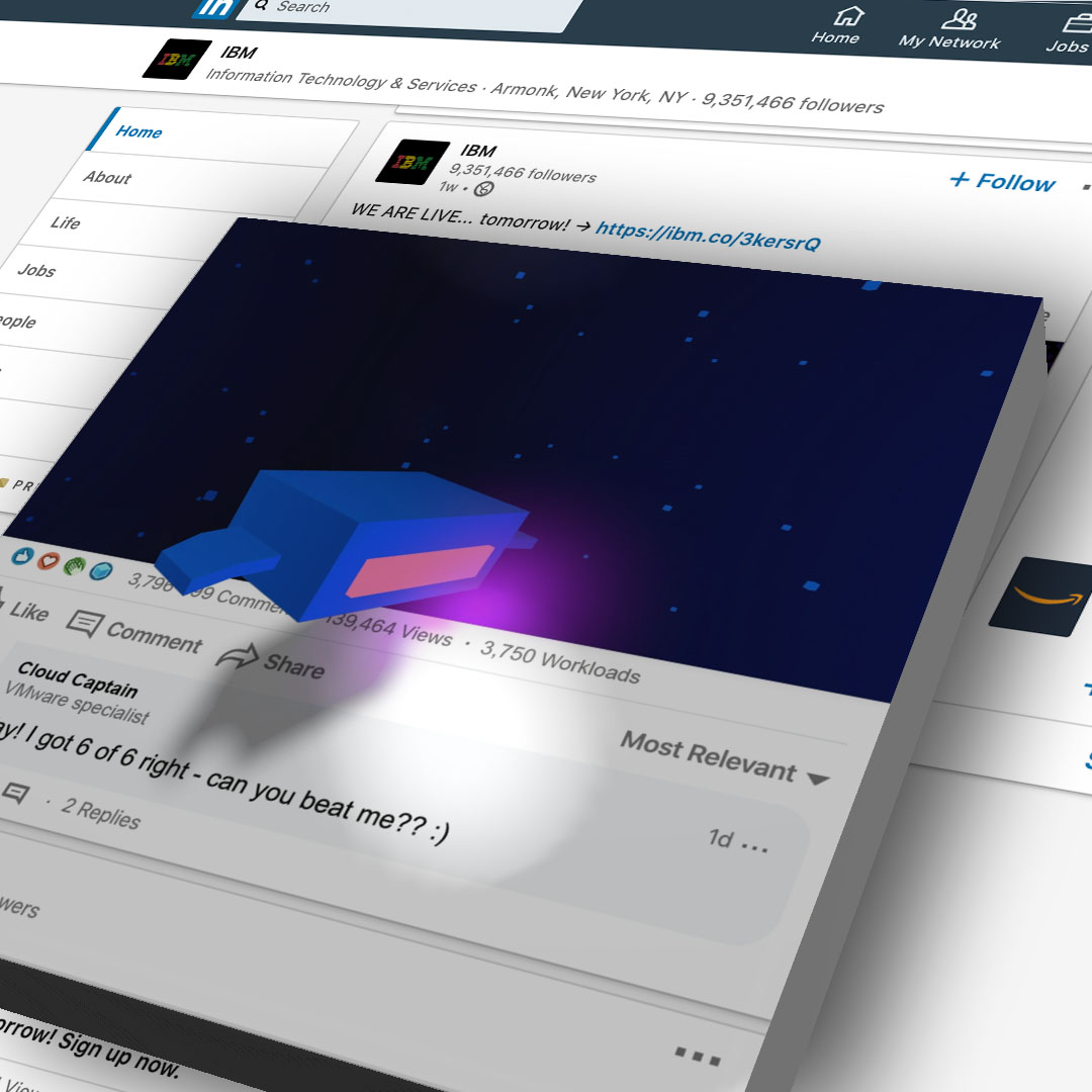
Out of the OrdinarySocial Media
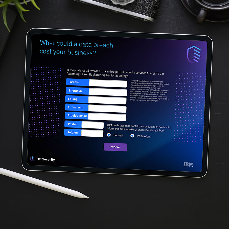
IBM Security JeopardyUX Design
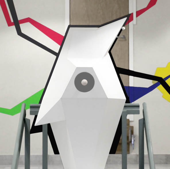
Heart of BollnäsArt installation

Code of conductIllustration

Star impactUnity VFX
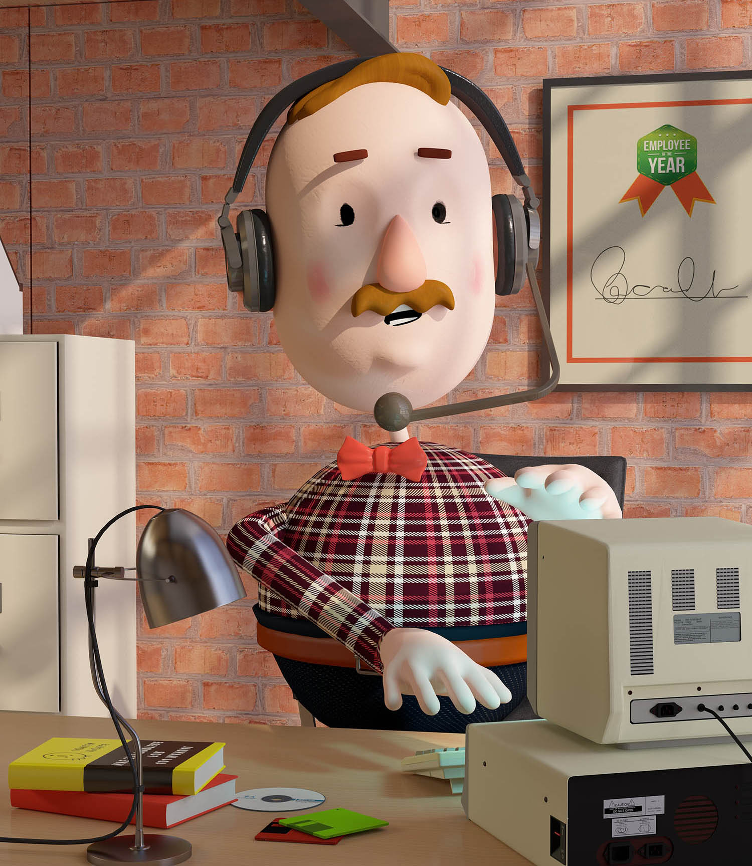
IBM WatsonExplainer Animation
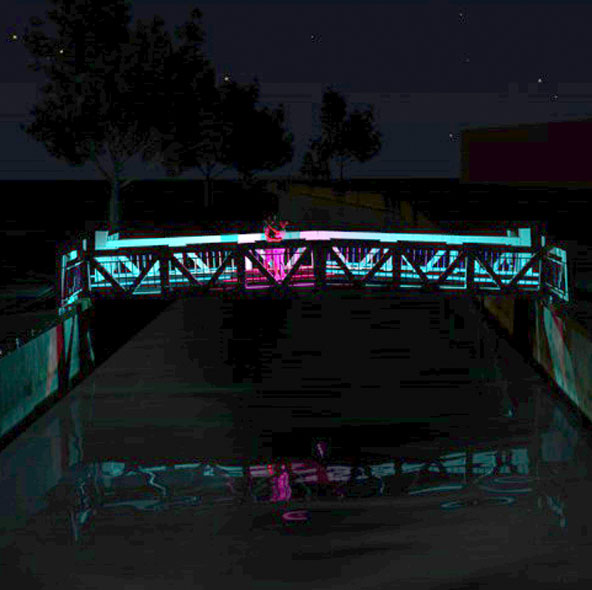
Bridges of SöderhamnArt Pitch
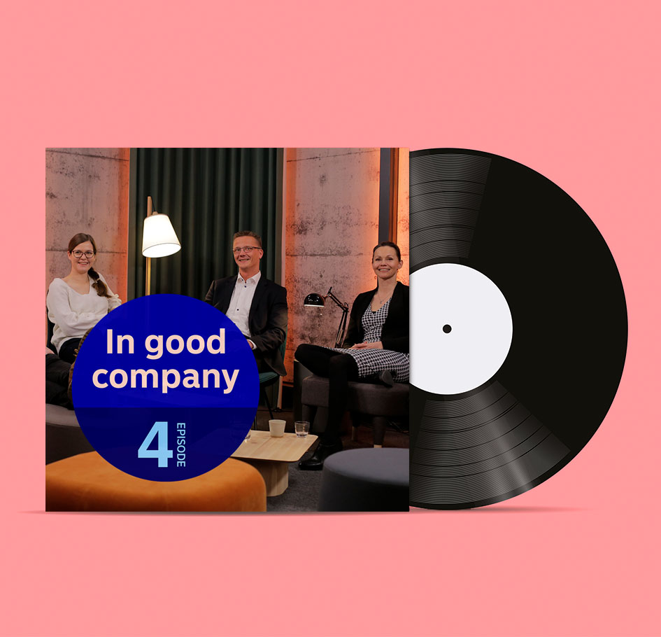
NordeaEVP Campaign
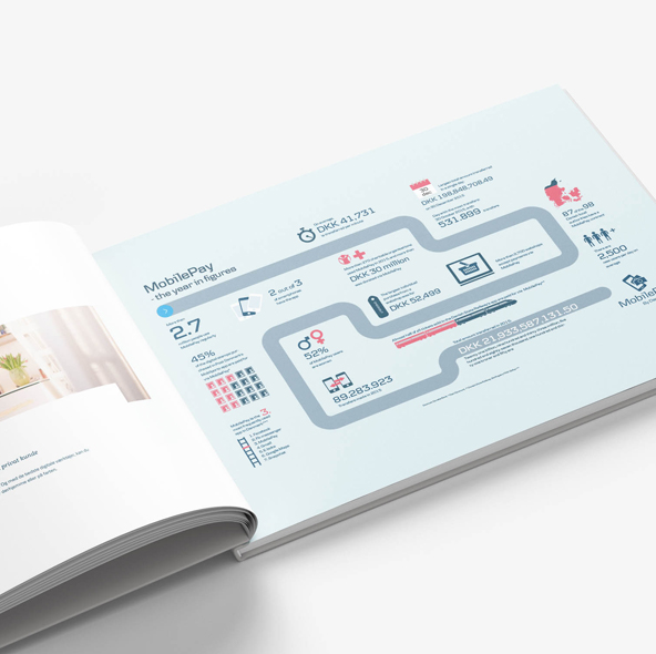
Danske BankInfographic
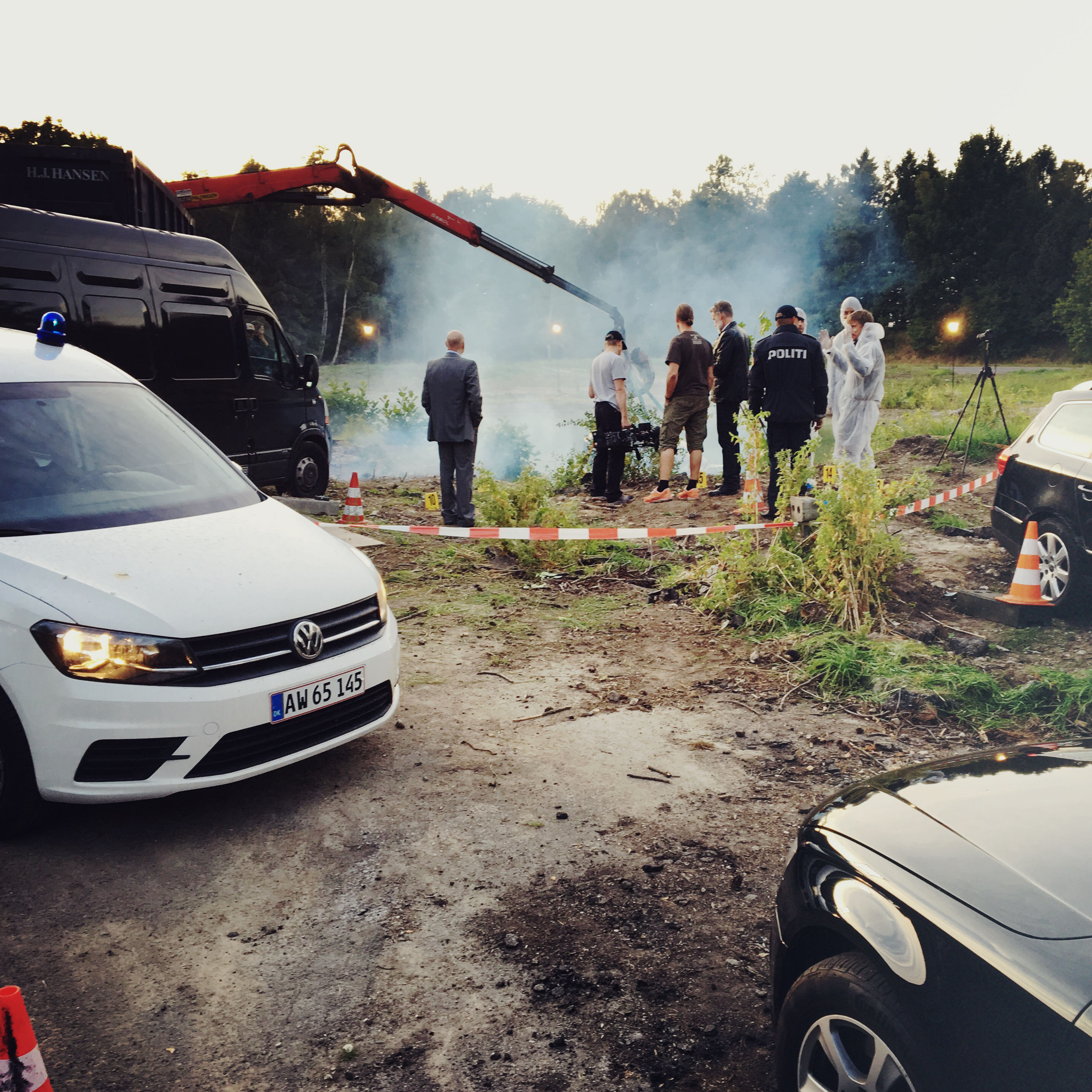
MiljøministerietPublic Campaign
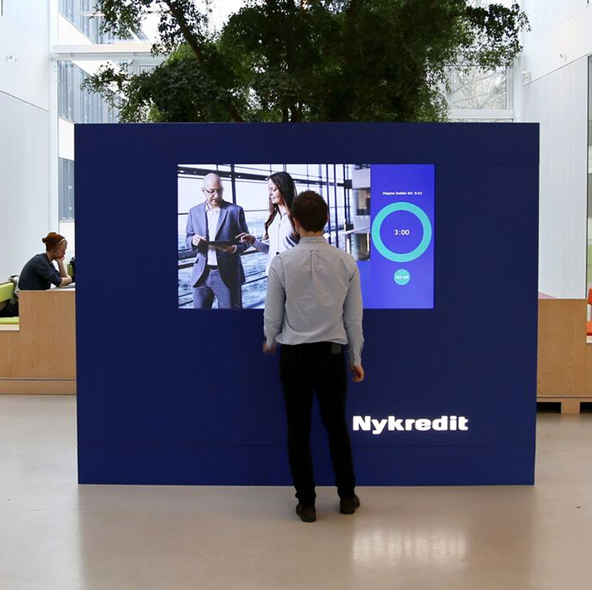
Nykredit Employer BrandingProject type

GEAExplainer film
Mobile PayB2B Animation
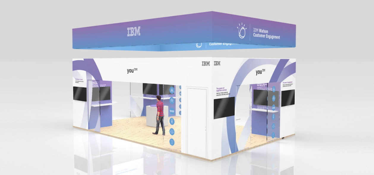
IBMExhibition Design
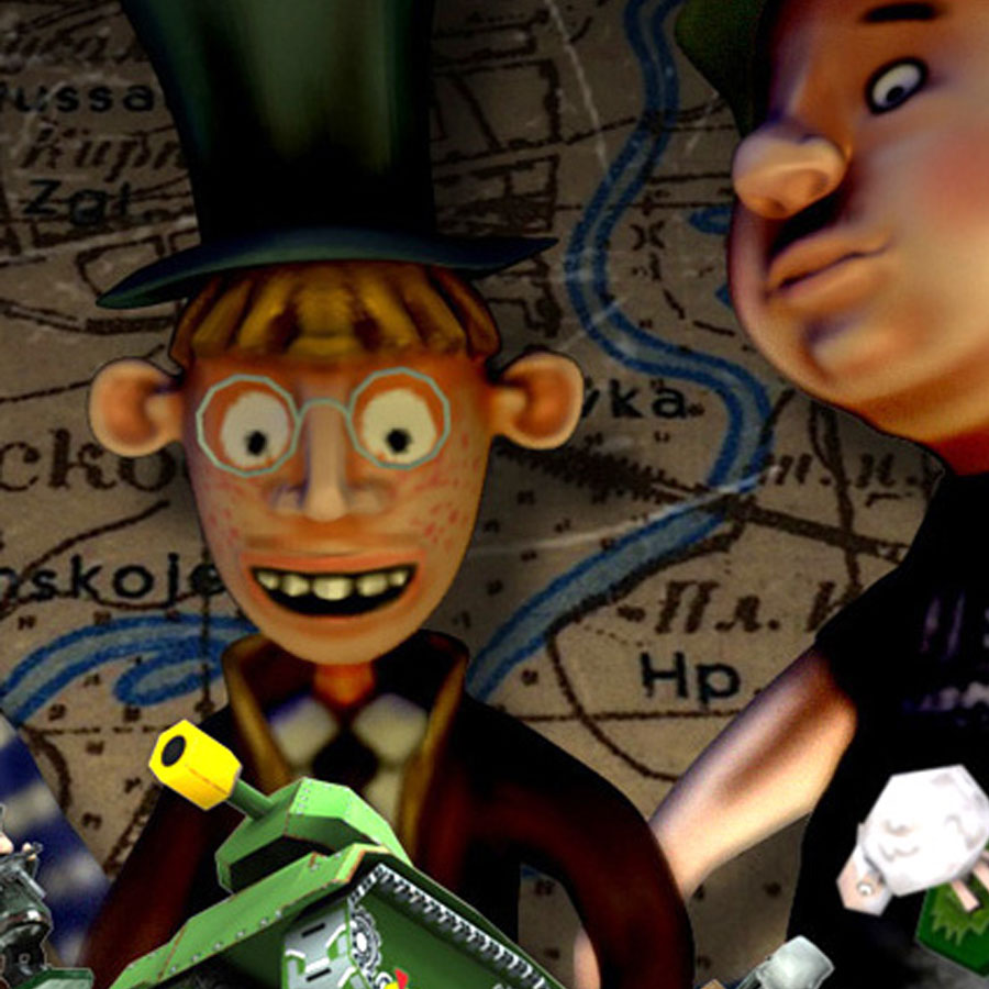
Panzer GeeksGame Art Direction

Burning BearBrand identity design
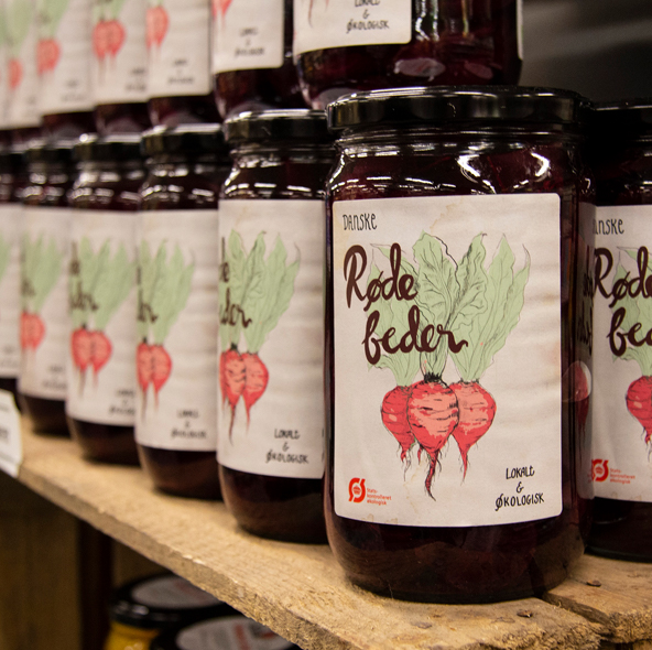
Take Me HomeProduct design
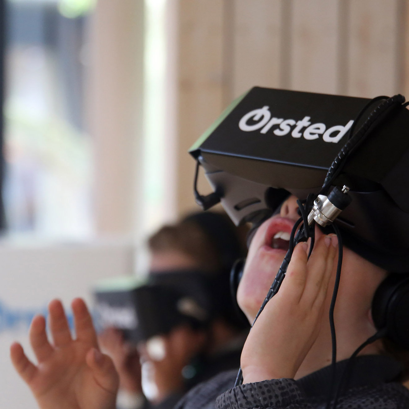
Ørsted DayExperience design
